Okay, I’ll grant that the themes that come with the Ice Window Manager from its source repository are quite unattractive to many. Drab, flat gray or annoyingly contrasting colors scream “mid-1990’s”. Thick solid-color borders not only waste space, but are unattractive to boot.
An example? here: 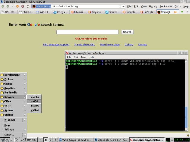
That’s the Motif theme. If you don’t know what the Motif toolkit is, Wikipedia should be able to help somewhat. The toolkit was designed back in the 1980’s, so the look is a bit dated. There is a yellow version as well, which is much less drab, see it after the “More” break:
 Note the yellow title bar and the somewhat modernized and colorized Minimize, Maximize, and Closerize –er, Close 😳 — buttons. It’s amazing what a little splash of color does. 🙂
And how can we forget the IceDesert theme that greets new IceWM users in the first place? We cannot, that’s how! 😛
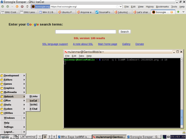
It’s very unfortunate that these themes, along with the other all-very-similar-except-one themes, are the default set. There are some incredible themes that blow anything that Metacity (Gnome2’s WM) or Openbox (LXDE’s WM, since they dropped IceWM) can dream of.
For example, the Infadel2 theme used as an example in the current (ha!) IceWM theming manual and included in the source package:

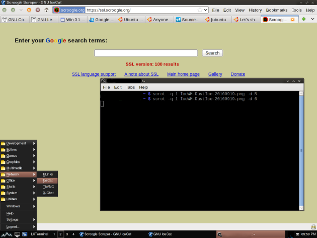
The beautiful and *not copying another operating system’s look* DustIce theme (menu looks best with gradient support):
Port of the Azenis WindowBlinds theme to IceWM (old screenshot):

Did I mention that IceWM has rounded corners? Yes, you can use XPM transparency! No PNG/alpha transparency, apparently, but the XPM transparency works just fine thank you.
 If you look closely, you’ll see that this theme has it’s own mail icon. Also, it uses icons that are either duplicates of or actually are the Windows 95 application folder icons in the menu . . . you might not like that, but you can replace it.
Hopefully you won’t mind me not providing full-screen screenshots of the rest of these — I only get so much storage space here. 🙂
The “Tile” theme, which you can find buried in Debian’s icewm-themes package:

The “Natural” theme, also in Debian’s icewm-themes package:

The “device” theme (Debian’s icewm-themes again), which seems really familiar to me but I’m not sure why. It might have something to do with my playing a lot of early-1990’s games when I was younger; this theme’s window decorations feel like a game’s GUI from then. I’ve made this screenshot taller so you could see the more-intricate-than-usual design of the left- and right-frame images:
 Admittedly the window decorations are the main “cool feature” of this theme, as the taskbar is an unappealing dark blue, the menu (“Start”) button is a big “LiNUX” pixmap that doesn’t go well with the blue, and the menu has the Motif-esque gray chiseled arrows against a gray background. It still serves as an example of the more original designs, and of the capability to reorder and reposition the window controls in any desired way.
These are only a few of the themes IceWM has. Saying that IceWM is ugly because of the themes that come with it is like saying a house interior that hasn’t been painted yet, and is still plaster-on-drywall, is ugly. It can be made to look however you want to, and takes up a tiny sliver of your computer’s resources.
It can be setup up to look like anything from TWM to Winblows 7. Still don’t believe me? Look at this screenshot and the theme that makes it possible if you like, and tell me that doesn’t look disturbingly and trademark-violatingly like Windows 7. 😐
The sheer flexibility of it, combined with how lightweight and fast it is, makes me a very happy IceWM user. How nobody is still developing it, how awful the lack of comments in the source code is, and how spread out the community is makes me very sad.
But calling it ugly? That makes me laugh. 

 Note the yellow title bar and the somewhat modernized and colorized Minimize, Maximize, and Closerize –er, Close 😳 — buttons. It’s amazing what a little splash of color does. 🙂


It seems a tiny little bit ugly to me… but just because I’m an openbox user, and I envy the rounded corners capability
ugly, ugly, ugly
Back to serious commenting, you wrote:
“How nobody is still developing it, how awful the lack of comments in the source code is, and how spread out the community is makes me very sad.”
, and at that point, I believe that the main problem here is that lightweight Window Managers still tend to look like they are 80’s stuff.
I mean, if we look for “Show your desktop” on a KDE forum, the most amazing ones are showing stuff that openbox and IceWM sure can do. Elegant menus, mouse pointers and a cool wallpaper.
At this point, what I believe we, IceWM, whateverbox…users can do is basically called “guerrilla advertising”.
I myself was once a Windblows user and, while searching for “amazing tweaks” for my Pc, someone wrote, directly in an XP forum, a post showing his Archlinux with openbox. One month later, I was already myself an openbox user, and not because I found it useful or free, but because it looked modern and elegant. Of course, i had to tweak mine a lot, to reach the same looks, but still…
Openbox was at version 2 at that time, and we are already under version 3.4, being a default WM at some interesting projects…so I guess they showed the path to follow anyhow…
Ha ha. 😛
As for many themes looking like they’re from the 1980’s, that’s partly because so many themes used the “gtk” look, which uses Motif-style chiseled triangles in the menu to indicate submenus, and partly because many themes were designed to be similar to older, lighter window managers from proprietary UNIX implemenations — which, along with Motif, were designed in the very late 1980’s to the mid-1990’s or so.
And a *few* Windows95-like themes, of course. 😀
You can click the images of the themes to get a bigger view, by the way. I just didn’t want to use up people’s bandwidth. 🙂
Jaywalk must be the ugliest and most lacking in usability of all the themes in the official Icewm extra themes pack.